Graphics
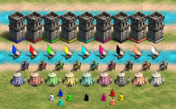
changes the player colours on the units,
Graphics, User Interface
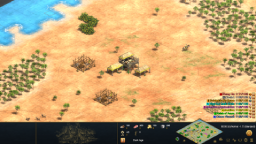
This mod replaces the UI by a compaxt, bottom centered UI in a dark blue/brass/gold style, heavily inspired by the AoE IV UI.
Graphics, User Interface
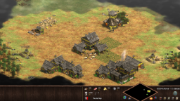
This Mod changes the UI to an all-bottom UI that is still regional, but much slimmer than the original UI.
User Interface
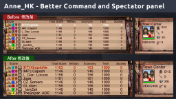
Increase Font Size , Change Text Color on Hover , Make User Interface Readable 放大字體, 修改選取文字的顏色, 增加界面可閱讀性
User Interface
Increase Font Size 放大字體, Change Text Color on Hover 修改選取文字的顏色, Make User Interface Readable 增加界面可閱讀性
Graphics, User Interface
Inspired by the female player base in the AoE2:DE community. This Mod attempts to bring more female characters to the in-game units, by making the following graphics changes: Militia – Joan of Arch (On foot). Spearman – Amazon Warrior. Archer – Amazon Archer. Knight – Joan of Arc (mounted) . West Monk – Yodit/Monk Cart . West King – Queen Hope you guys enjoy! Let me know what you think .Changes are Multiplayer Friendly.
Graphics
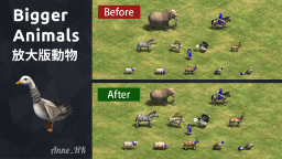
Resized Animals – Including: Goat, Goose, Pig, Sheep, Turkey, Deer, Ibex, Ostrich, Zebra, Elephant(smaller) 已修改的小動物包括: 山羊、鵝、豬、綿羊、火雞、鹿、羱羊、鴕鳥、斑馬、大象(變小)
Random Maps
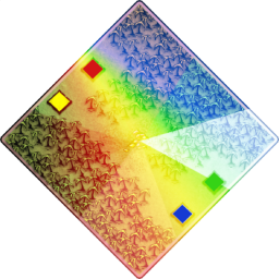
It’s Amazon Tunnel – but more sexy
Graphics
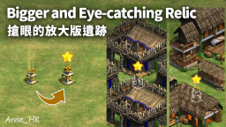
Bigger and Eye-catching Relic / 搶眼的放大版遺跡
Graphics
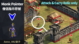
Adding a triangle pointer to the top of a monk(Attack & Carry Relic Mode only). It is easy for players to identify the location of monks. Not compatible with UHD version
Graphics
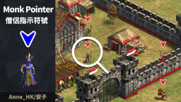
Adding a triangle pointer to the top of a monk. It is easy for players to identify the location of monks. Not compatible with UHD version
Random Maps
This map pack includes all the maps for the 2021 Helvetic 2v2 Cup. Most of the Maps were taken from the Two Pools tournament, big thanks to the map makers Chrazini and YoungPanda!
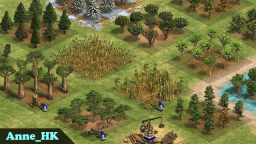
Graphics
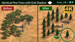
Including (1) Grid shadow Base,(2) No tree stumps,(3) Felled Trees Retouch (Improve the readability),(4) Not compatible with UHD-graphics
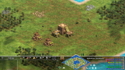
Graphics, User Interface
A more transparent version of my Centered Modern UI, as for multiple Requests 🙂
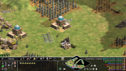
Graphics, User Interface
This mod changes the ingame UI and moves all the panels to the bottom of the screen. It includes a bigger minimap and an elongated map panel with space for the score. …
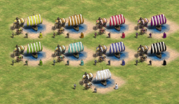
Graphics
Since Krogoth’s colour picker tool (thank you!) is online again, I’m back at making colour palettes, here’s one for april
Graphics
Including (1) Grid shadow Base, (2) No tree stumps, (3) Felled Trees Retouch (Improve the readability),
Artificial Intelligence, Campaign, User Interface
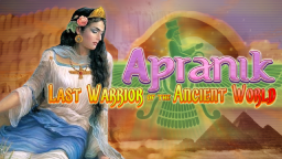
Born into a dynasty of military commanders, a young Persian woman named Apranik aspires to become a…
Graphics, User Interface
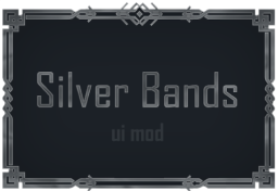
This mod replaces the panels for the user interface with dark blue ones with silver details on the borders. The mod was optimized for 100% HUD scale, the font size for the serif font, but it also works with th sans-serif font.
Graphics
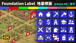
UHD graphic pack Supported. Building Foundation Label (with Player Color) / 建築地基標籤 (附玩家顏色)
Graphics, User Interface
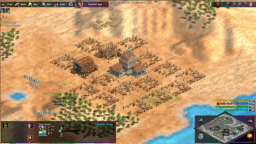
A more colourful version of the opaque UI. The details on the panels are rain-bow coloured, as is the loading bar when waiting for a game to start and ageing up. Reuploaded due to categorizing issues.

Artificial Intelligence, Campaign, User Interface
NOTE: For the full experience, please also subscribe to the Tomislav Supplement mod…
Music, Sounds, Speech, User Interface
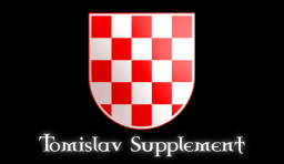
An aesthetic supplement to the Tomislav King of Croatia campaign. Since the campaign uses the Portuguese as its base civilization, this mod replaces the Portuguese vocal clips, theme music, and emblems with new ones representing the Croats instead.
Graphics, Menu Background, User Interface
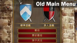
This mod is not compatible with the server maintenance countdown timer. You can disable this mod during server maintenance and enable it after the maintenance finishes.
Graphics
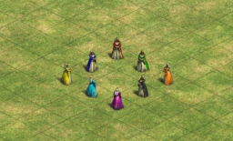
This mod replaces the kings’ graphics with a queen. So far sadly I only have the western queen graphics that came with the game. The mod doesn’t change the name of the unit so sadly it still says ‘king’.
Graphics, User Interface
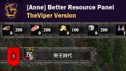
Hi, Viper~ Thanks for your apprecation about this mod!
Graphics, User Interface
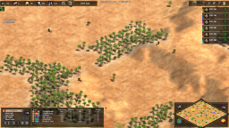
Replaces the ingame panels with a minimal dark design, with opaque background and golden details.
Graphics
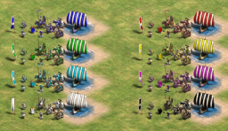
This mod replaces the colour of units and buildings for P7 (grey) with white and for p8 (orange) with black, for all the folk that dislike orange, like me :)…
User Interface
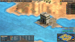
Moves up the Tech/Unit research panels when spectating to right unerneath the Menu. I’m using a UI mod but the panels will also move if you don’t 🙂
User Interface
Changes the user overlay to a black/golden design, using decorative elements from within the game.
User Interface
You will have to restart the game to enable the mod. If you experience issues (for example the text being dark instead of white), try upping the mod’s priority as it might be interferring with other mods.
Graphics, User Interface
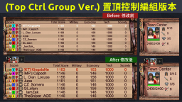
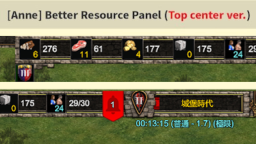
This is a top center version (置頂中版本)…
Graphics, User Interface
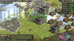
The mod changes the UI panels, for playing and for speccing/watching recs. The panels are minimal with a thin ornate border taken from the game’s graphics and an opaque background. The mod also makes the Spectator Overlay text bigger.

Random Maps
Contains: PRC_Death Valley, PBC_Frisia…
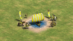
Graphics
This mod replaces p4 (yellow)’s unit and buildings colour with a brigther, shining yellow. Only changes p4’s colour and works with other colour mods.
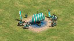
Graphics
This Mod replaced p6 (teal)’s unit and building colour with a brigther cyan colour. It works with other colour mods too, just have this mod’s priority higher and it will only change p6.
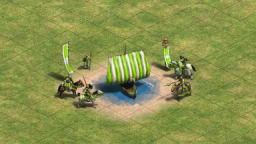
Graphics
This mod replaces the green player’s builinding and unit colour with a brigther, more warm grass green.
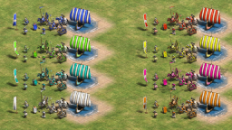
Graphics
This mod replaces all players’ units and builings colours with a very bright variant. This works great with pink, yellow, teal and green, less good with the naturally darker colours 🙂
Graphics
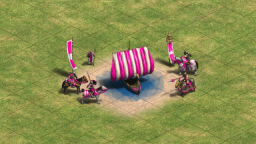
This mod changes the colour of player 6’s of units and builings from purple to a very bright pink. You can use it with other colour mods too, just make sure it’s priority is over the over mod, and it will only change p6.
Graphics, User Interface
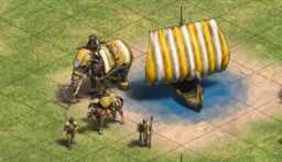
Changes the Units and Buildings of Player 4 (Yellow) to a warmer golden colour.
Graphics, User Interface
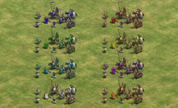
This mod replaces the player colours (on the units) with a basic set, using white for p7.
Graphics, User Interface
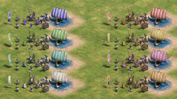
Replaces all player colours by a pastel colour, including white for grey and pink for purple.
Graphics, User Interface
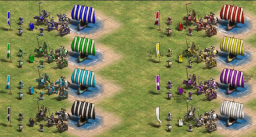
This Mod replaces the grey player colour (p7) with black and the orange player colour (p8) with white. The colours are also changed on the minimap, in chat and in the timeline, working on getting them to the health bars.
Graphics
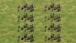
Changes player colours to a darker variation. These might not be the best to differentiate but they are very classy.
Graphics, User Interface
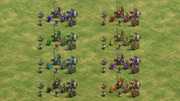
Changes Players colours to a basic palette with both pretty and easy to differentiate colours. Player 7 is a very dark grey, almost black.
Other
Contains the following maps: SB_Cross, SB_Decentring…
Other
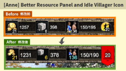
Increase the font size and change the font color (resource worker) in the resource panel….
Graphics, User Interface
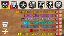
隨著新DLC(勃根地 和 西西里)的推出, 馬利會由(里)改做(利), 新DLC則命名為 勃根地(地), 西西里(里), 並配上特別的圖示背景色以作識別。
Random Maps
Graphics
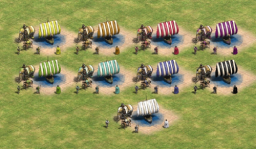
Since Krogoth’s colour picker tool (thank you!) is online again, I’m back at making colour palettes, here’s one for april